Two scales in ggplot2
There’s situations where it makes sense to overlay two (seemingly unrelated) pieces of information in one plot (a.k.a. diagram/chart). There’s reasons not to do it (or at least apply caution) but anyways: this post describes how to just do it and how it compares to alternatives.
There has been a vivid discussion on stackoverflow on whether this is detrimental or legit and also on how to actually implement it (the solution given is not-so-very-obvious, but works like charm). The stackoverflow discussion is actually a great read for the most part (incl. a great alternative dummy facetting). I was curious about how to do it (based on the s-o solution; legitimacy aside) and also about the comparison of one diagram with two scales VS two diagrams above one another.
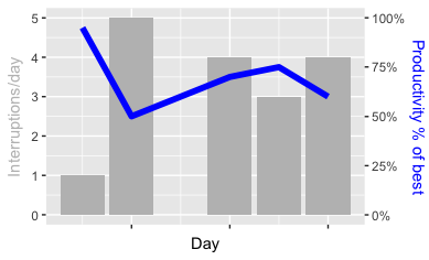
I start off with a simple (and purely fictional) data set: for five days, it tracks the number of interruptions VS productivity. Sure everyone can relate. The dataset dt looks like this:
        when numinter prod
1 2018-03-20        1 0.95
2 2018-03-21        5 0.50
3 2018-03-23        4 0.70
4 2018-03-24        3 0.75
5 2018-03-25        4 0.60
(numinter is the number of interruptions and prod the productivity in percent)
Taking this into ggplot starts quite straightforward:
ggplot() +
  geom_bar(mapping = aes(x = dt$when, y = dt$numinter), stat = "identity", fill = "grey") +
  geom_line(mapping = aes(x = dt$when, y = dt$prod*5), size = 2, color = "blue") +
  scale_x_date(name = "Day", labels = NULL) +
  # (more)
The stat = "identity" part is required to convince geom_bar to just take values as-is; otherwise, all the code does (so far) is specify colors to print and the caption of the x-axis. Hold the question about the *5 in the line specification for a minute.
The crucial line is the next one:
  scale_y_continuous(name = "Interruptions/day",
    sec.axis = sec_axis(~./5, name = "Productivity % of best",
      labels = function(b) { paste0(round(b * 100, 0), "%")})) +
  # (more)
This line defines essentially all the magic: it starts simple, by giving the caption for the left bar. The essential part is sec.axis: it expects a formula for the labels. Before, I multiplied all values by 5 (effectively, the right part’s upper bound was 5 times less than the left’s part - and multiplying by 5 ensures that both bar and line have really the same range). In order to represent the numbers right, I now divide by 5 again. Bringing sec_axis in gives me a 2nd set of labels - and I can define how to print the labels in detail by specifying a labels function.
All there’s left to do is brush up colors:
  theme(
    axis.title.y = element_text(color = "grey"),
    axis.title.y.right = element_text(color = "blue"))
And that’s it, really. The result then looks like this:
Just for comparison, I’ve also followed dummy facetting outlined in above stackoverflow post and the ggplot2 wiki. Except for getting different scales (which is possible), it’s straightforward to do:
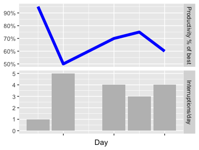
You can judge for yourself which one better transports the message (“Don’t disrupt people at work!”). Anyways: I’ve put up a gist with the full source code of both approaches. As ever, I hope it’s useful; feel free to try it - and let me know what you think!