Half the people of Germany live in these few areas
Mental Floss provided the inspiration with a post on counties with half the U.S. population. Spoiler: it’s not that many - esp. compared to mainland U.S. overall. I sat down on some fridays to find out whether one can draw a similar map for Germany (and whether it’s that extreme).
First of all, I used German Wikipedia to pull out data for all cities and (non-city) counties. In fact (and different from the U.S.), counties in Germany never contain larger cities (hence ‘non-city’). There’s exceptions to the rule (like the Hannover Region); yet, the rule as such is quite stable and I’m going with it. I pulled out the cities and counties into a Spreadsheet, brushed up the data, sorted by density (descending), and summed up how many people live in the densest cities so far. This already produces some nice results:
- 50% of the population live on about 12% of the area
- 30% of the population live on (just) about 3% of the area. It would be nice to see this separately.
Doing a first sanity check shows the numbers add up to an overall population of a little above 82 million and to an area a little above 357k square kilometers. Consistent with Germany’s Wikipedia entry - so far so good. I did export this into a CSV that’s available as gist. All R code below just uses this CSV, here’s the first lines:
Was;Name;Einw;Einw_wert;Fl_qkm;BevD_per_qkm;BevD_ctr;Einw_kum;Fl_kum
S;"München";1450381;1450381;310.7;4668;4668;1450381;311
S;"Berlin";3520031;3520031;891.69;3948;3948;4970412;1202
S;"Herne";155851;155851;51.42;3031;3031;5126263;1254
S;"Stuttgart";623738;623738;207.35;3008;3008;5750001;1461
S;"Frankfurt am Main";732688;732688;248.31;2951;2951;6482689;1709
What I now need is a map. I first thought of ggmap - however, a 2009 post on “Infomaps using R” pointed me to the GADM map data. It’s only free for non-commercial - but that’s fine for me b/c hey! everyone gets the stuff for free ;-) GADM provides .rds files that require the sp library to be installed. The sp intro shows quite nice possibilities, just using plot, so I’ll go for that.
First step in R is now (aside from loading sp), to load our CSV and the GADM data plus to join it (the GADM needs to go first in order not to lose the geo infos):
library(sp)
df <- read.csv('halfofde.csv', sep=";")
adm <- readRDS('DEU_adm2.rds')
dfM <- merge(adm[(adm$TYPE_2=='Landkreis' | adm$TYPE_2=='Kreis'),], df[(df$Was=='K'),], by.x="NAME_2", by.y="Name", all.y=TRUE)
dfM <- rbind(dfM, merge(adm[!(adm$TYPE_2=='Landkreis' | adm$TYPE_2=='Kreis'),], df[!(df$Was=='K'),], by.x="NAME_2", by.y="Name", all.y=TRUE))
I end up with dfM holding a data frame that is ready to be plotted, holding both the geo infos and the density (how many people live in this or more dense areas) from the CSV. It’s important to merge cities and counties in seperate steps (and to filter right), because, there can be a city and a county with the same name (like Augsburg and many others) but still quite different data. In the CSV, the use the first column to distinguish; in the GADM data, there is a TYPE_2 column doing the same. In the end, I can rbind everything into one data frame.
It makes sense at this point to do a couple of sanity checks, like counting nrow(df) and nrow(adm) as well as nrow(dfM). When checkfing dfM, it makes sense to go for head(dfM@data) et al to avoid endless geo coordinates being printed out. Most importantly, I did check for entries from the CSV that did not match anything in GADM via dfM[is.na(dfM$OBJECTID),]. This did in fact yield to the CSV being corrected for 7 or so spots. I could have done the same in R code, but chose to be quick here. In the end, I needed (and do now have) a correct data set.
The checks show that there’s a discrepancy of one entry (out of more than 400, that’s one quarter of a percent) - so I ignore this going further. It also shows that two entries (one of them a lake) don’t match the CSV and have no density info. In order to be able to filter properly, I filter this out:
dfM <- dfM[(!(is.na(dfM$Einw_kum))),]
It’s hard to believe, but I’m almost done. All I need to do is plot mega-dense areas (green; the about 3% where about 30% live), dense areas (yellow; the remainder of the about 12% where 50% live), and the rest (white). I pulled the cutoff levels from the spreadsheet (could also be the CSV). add=TRUE makes the drawings additive:
plot(dfM[(dfM$Einw_kum>41614117),])
plot(dfM[(dfM$Einw_kum<=41614117 & dfM$Einw_kum>24988310),], col='yellow', add=TRUE)
plot(dfM[(dfM$Einw_kum<=24988310),], col='green', add=TRUE)
So this is it - yeah! I get this map:
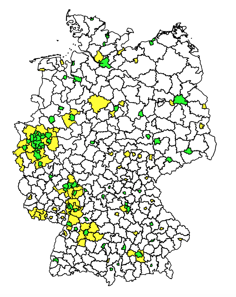
One can easily recognize Hamburg, Berlin, the Ruhr area, Rhine-Main area, etc. All overall, Germany’s area is just smaller than the U.S. So the distribution is naturally not that extreme. Still: there is more than factor 100 from the densest area (city of Munich) to the least dense area (Prignitz county) - and about 12% of the area are home to half the people. What’s most astonishing is the green areas: so small and yet so much life going on there!
I put the code into a gist along with some explanations. Feel free to try it out - and let me know what you think!