animated pies with React (and D3)
React (the browser-version) supports both HTML and SVG. I sat down (TGIF) to find out how far SVG (only) can take me to do visualizations that look ok and are animated in some (helpful) way. Turns out it’s not that hard after all. Here’s how do create a pie chart…
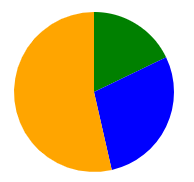
First of all, here’s my sample data:
let dt=[5, 8, 15];
let colors=['green', 'blue', 'orange'];
Having that, I need a React component (PureComponents make React so much more fun - though it doesn’t matter here):
class Pie extends React.PureComponent {
  render() { return (
    <svg height={100} width={200}>
      <g transform="translate(50, 50)">
        {dt.map((n, i) => (
          <path d={'M 0 0 L '+arcStart(i).slice(0, 2).join(' ')+' A 40 40 0 '+(arcStart(i+1)[2]?1:0)+' 1 '+arcStart(i+1).slice(0, 2).join(' ')+' Z'} fill={colors[i]}></path>
        ))}
      </g>
    </svg>);
  }
}
This code creates a new SVG image, shifts the center of the coordinate system 50 points in and down (will become the center of the pie - I’ll explain why in a second), and translates each data point into an arc from 12 clockwise. It starts from the center M 0 0 and draws a line L to the start angle (the part of a full circle of all elements corresponding to all data points before this one. It moves on to draw an arc with radius 40 A 40 40 that has Arc properties set:
- leave the X-Axis (x-axis-rotation) as-is (is a circle anyway)
- sets large-arc-flag depending on the data point: when a data point is more than half of the overall data set, use 1 for the long circle, otherwise 0 for the short one. Leaving this out produces strange curves for parts of the pie which are larger than the half.
- sets the sweep-flag to use the convex part (1; experimentation reveals it quite quickly)
Finally, it moves to the end angle (part of the circle corresponding to all data points including this one) and back to the start. It uses the color corresponding to the point.
So, I’m done - almost: still need arcStart to compute the x/y of the points to start/end the arc:
let arcStart=(i) => {
  let share=dt
    .filter((_n, _i) => _i<i)
    .reduce((_s, _n) => _s+_n, 0);
  let all=dt
    .reduce((_s, _n) => _s+_n, 0);
  return [
    40*Math.cos(2*Math.PI*share/all-Math.PI/2),
    40*Math.sin(2*Math.PI*share/all-Math.PI/2),
    (dt[i-1]>(all/2))
  ];
}
It looks more frightening than it is actually is: compute the share of all values before the given index, compute the sum of all, compute the fraction of 2 times PI this is (2*Math.PI*share/all), fill into cos for the x coordinate / sin for the y coordinate, scale up from 1 pixel to 40 pixels max and rotate by minus half PI (-Math.PI/2) so we start at twelve instead of three (per se, sin(0) is 0 and cos(0) is 1 - I shift to 1 and 0 instead). There is an explanation for Sine and Cosine on Wikipedia. The function gives a triple of x, y and large arc or not. All it then needs is feeding it into the path spec.
The component is ready to be rendered:
ReactDOM.render(<Pie/>, document.getElementById('pie'));
All overall, I get the pie below (50/50 away from top/left with a radius of 40):
One way to bring in animation is scaling on hover of a path a.k.a. slice of the pie (others could be displaying stuff on hover of a group, etc.). Scale transforms start with the coordinate root (0/0), so the translation above (plus starting each slice at 0/0) is a good start. All I need then to nicely grow the currently hovered slice is this CSS:
path {
  transform: scale(1);
  transition: transform 1s;
}
path:hover {
  transform: scale(1.2);
}
(In a larger project, I could set a class name to the paths; for here, it just works).
I’ve created a codepen to show this. The left of the pies is just what above code creates, The right pie does (almost) the same, just instead of computing arcs and pixels manually, it borrows logic from great D3. I create a pie from the test data and feed the pie slice specs into paths:
class Pie extends React.PureComponent {
  render() { return (
    <svg height={100} width={200}>
      <g transform="translate(150, 50)">
        {d3.pie()(dt).map(d3.arc().outerRadius(40).innerRadius(0)).map((a, i) => <path d={a} fill={colors[i]}></path>)}
      </g>
    </svg>);
  }
}
The pie function returns angles for each part of the pie, which arc translates into the path spec ready to be filled into the tag (along with the color; by the way: innerRadius !=0 makes it a donut). See D3-Shape for details on pies, there are other useful helpers like D3-Scale for converting values to pixel offsets. Still, I can stay within React which makes it really cool. D3 arranges the slices slightly differently, but so what!
To get the codepen working, I had to tweak the pen’s JavaScript settings:
- turn on JSX (by activating Babel as preprocessor)
- include the React and D3 libraries
(just check the pen settings to find out how).
You find both pies in this codepen, ready to use. Or check out the gist - feel free to try out and let me know what you think!
P.S.: The code above is still hard-wired to the test data set. It’s just a short way from being a generalized component, however.