Responsive tables (pretty much WiP)
Tables don’t look good on small screens - at least not per se. Conventional wisdom has it that rows should be converted to tiles stacked above one another. This does indeed very often solve it nicely - at least as long as reading column-wise (like comparing values along a column) is not desired. This post looks at some ways of getting better here.
Inspired books like the Smashing Book #5 suggest some more alternatives, like selecting the columns (see RWD Table Patterns for more) which is great and a step forward (as comparing along a column becomes feasible). I set out to try a couple other ideas (with a shortlist of two: one of them sucks, one I’m going to present below).
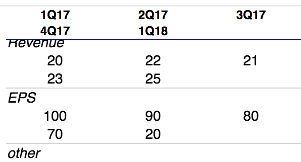
Core of my idea is to turn the table rows into containers for blocks of defined size that wrap - so that one logical row might wrap to several rows in such a way that the n-th element is always at the same spot (say: 1st in 2nd row). This makes columns comparable while displaying a rather huge number of columns. In order to make it readable, each logical row needs a bottom border (and ideally, the header is sticky). When the first col has a special meaning, one can either only have cols 2+ wrap (see codepen for this) or (described here plus see codepen) the first col takes the full width and is marked (e.g. in italic).
All overall, this yields a pretty decent result already: there is meaningful info even with larger tables.
Here’s the code to achive this:
thead tr {
  border-bottom: 1px solid darkblue;
}
tbody tr {
  border-bottom: 1px solid lightgrey;
}
.variant-flexwraptwo thead {
  display: block;
  top: 0;
  position: sticky;
  background: white;
}
.variant-flexwraptwo thead tr,
.variant-flexwraptwo tbody tr {
  display: flex;
  flex-wrap: wrap;
}
.variant-flexwraptwo thead th:nth-child(1),
.variant-flexwraptwo tbody td:nth-child(1) {
  display: inline-block;
  width: 100%;
  font-style: italic;
  text-align: left;
}
.variant-flexwraptwo thead th:nth-child(n+2),
.variant-flexwraptwo tbody td:nth-child(n+2) {
  display: inline-block;
  width: 95px;
  text-align: center;
}
The result will look somewhat like this (incl. scrolling with stick headers):
I put up a codepen with two variations of using flex wrap (plus tiles and the subpar indent option for comparison). This is far from ready though: sticky headers only work on Chrome so far and many other areas need more love. It’s functional though - hope you find it useful & let me know what you think!