Shiny 4 real (sentiment analysis)
The Test-drive of Shiny with CouchDB involuntarily showed a lot that’s not possible (at least not easily). So this post focuses on Shiny once more - this time playing more of the strengths of the framework (i.e. displaying insights). I take the data from gRasping the sentiment, which is a matrix dfDimM of how often which sentiment appears in which song (showing the first two lines):
             love nationalanthem outofthewoods power
anger          17             15             4    25
anticipation   14             29             6    13
Now, instead of drawing a static bar chart (barplot(t(dfDimM), ...), I import library(shiny) and invoke shinyApp like this:
# all code computing dfDimM would be here
shinyApp(
  ui = fluidPage(sidebarLayout(
    sidebarPanel(verticalLayout(
      selectInput(
        "songs",
        "Choose one or more songs:",
        colnames(dfDimM),
        multiple = TRUE,
        selected = colnames(dfDimM)
      ),
      selectInput(
        "sentiments",
        "Choose one or more sentiments:",
        rownames(dfDimM),
        multiple = TRUE,
        selected = rownames(dfDimM),
        selectize = FALSE,
        size = nrow(dfDimM)
      )
    )),
    mainPanel(plotOutput("plot"))
  )),
  server = function(input, output) {
    output$plot <-
      renderPlot(barplot(t(dfDimM[input$sentiments, input$songs]), beside = TRUE, legend = TRUE,))
  }
)
and in fact: this is it, I’m done! Running this (via R Console or RStudio) produces a dashboard. RStudio also reliably kills the server process, which is quite convenient while developing.
Some details on the implementation
First of all, the sidebarLayout gives me the ability to have inputs for options on the left (sidebarPanel) while having the plot take up all the remaining space (mainPanel). In my case, there’s two options: which songs to show and which sentiments to show (default is all songs and all sentiments). For the sentiments choice, I deviate from the default of using selectize (i.e. selectize.js) back to using a “normal” select box with all items visible at once. While selectize.js is really cool, it makes selecting or de-selecting many items rather daunting. But good to know I have the choice, and for songs, it’s really nice.
Apart from that, it’s all about displaying the data. For more than a couple of songs, I’d probably pull and compute dynamically. Here, as I have only four songs, I barplot a slice from pre-defined dfDimM based on the inputs.
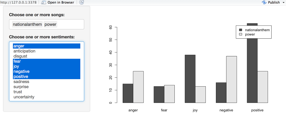
In the end, this is how it looks like - comparing some sentiments between ‘Power’ (by Keyne West) and ‘National Anthem’ (by Lana Del Rey):
As ever, feel free to try it (there is a gist available; you need the 2nd file called sentiments_shiny.R) and let me know what you think!